Data Science
Start learning data science.
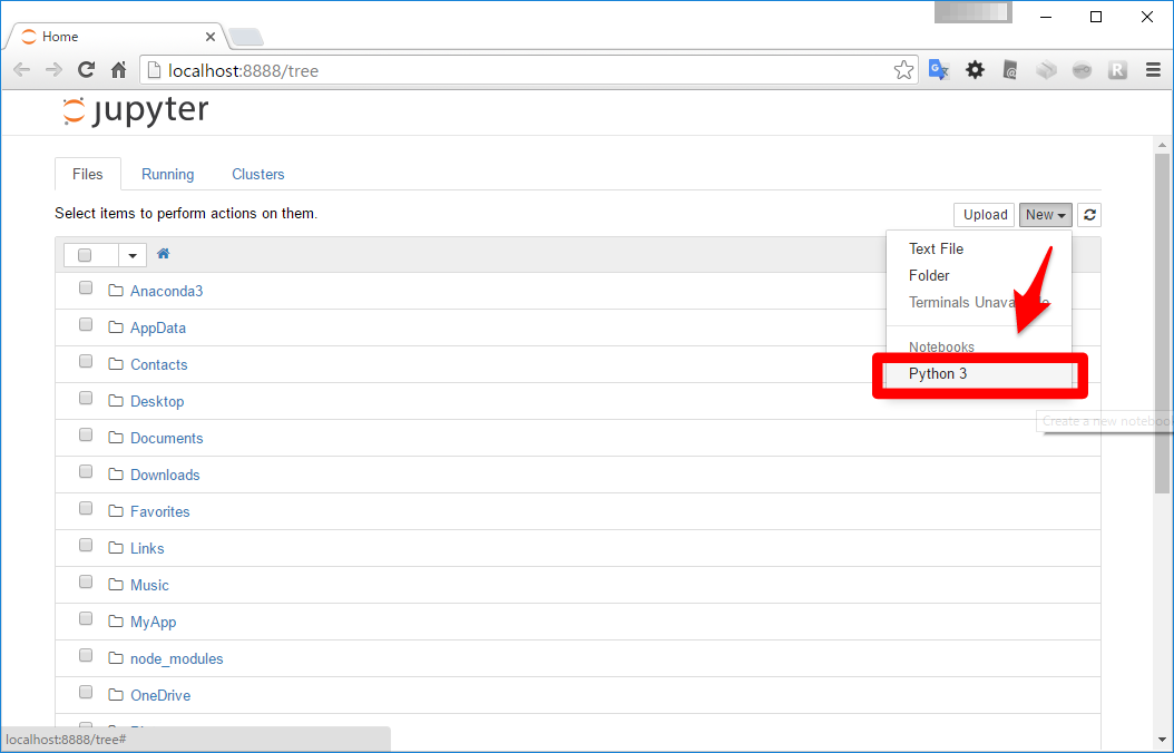
- Necessary to download Anaconda first.
- Execute
jupyter notebookin teminal.
- Select Python3 in jupyter notebook.
*Refered from other site.
How to visualize data
- Necessary to code
%matplotlib inlineat the first line.
- All necessary process has been done. Now you can keep codeing like whatever you want to code.
What is logistic regression model?
It's much easier to understand what logistic regression model is with thinking about a classifier of a spam e-mail. Basically, a spam e-mail filter classify which is a spam or not. There would be some experiences like an e-mail should be classified as a spam got to through the filter. On the other hands,an email should be classified it's not a spam got to classify as a spam. So we need to take steps to predict with deep learning. Classifying it's not a spam when program thinks the prediction is weak. This is one of methods to reduce the bad possibility such as classifying an e-mail as a spam. For doing this,we need to measure how reliable the prediction is.
Review of perceptron.

*Refered from other site.
Frankly to say,perceptron is a binary classifier which predicts which kind of data points with classifying f(x) is plus or minus.
Generating visualized data.
>|python|
%matplotlib inline

import numpy as np
import pandas as pd
import matplotlib.pyplot  as plt
from scipy import optimize

plt.style.use('ggplot')

def make_data(N, draw_plot=True, is_confused=False, confuse_bin=50):
    '''N個のデータセットを生成する関数
    データをわざと複雑にするための機能 is_confusedを実装する
    '''
    np.random.seed(1) # シードを固定して、乱数が毎回同じ出力になるようにする

    feature = np.random.randn(N, 2)
    df = pd.DataFrame(feature, columns=['x', 'y'])

    # 2値分類の付与:人為的な分離線の上下どちらに居るかで機械的に判定
    df['c'] = df.apply(lambda row : 1 if (5*row.x + 3*row.y - 1)>0 else 0,  axis=1)

    # 撹乱:データを少し複雑にするための操作
    if is_confused:
        def get_model_confused(data):
            c = 1 if (data.name % confuse_bin) == 0 else data.c
            return c

        df['c'] = df.apply(get_model_confused, axis=1)

    # 可視化:どんな感じのデータになったか可視化するモジュール
    # c = df.c つまり2値の0と1で色を分けて表示するようにしてある
    if draw_plot:
        plt.scatter(x=df.x, y=df.y, c=df.c, alpha=0.6)
        plt.xlim([df.x.min() -0.1, df.x.max() +0.1])
        plt.ylim([df.y.min() -0.1, df.y.max() +0.1])

    return df

df = make_data(1000)
df.head(5)
||<
